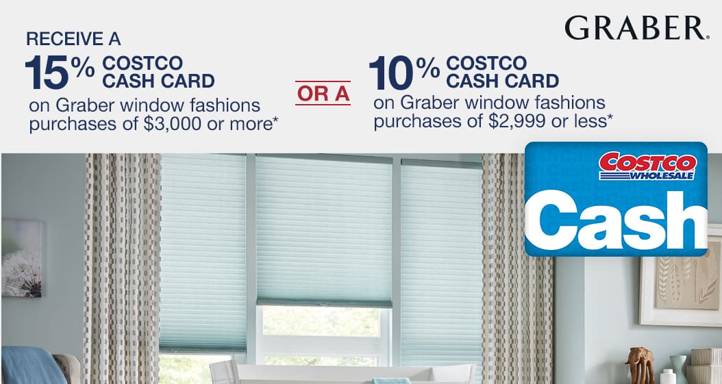
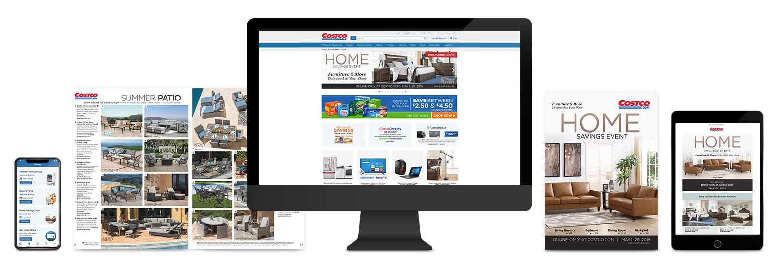
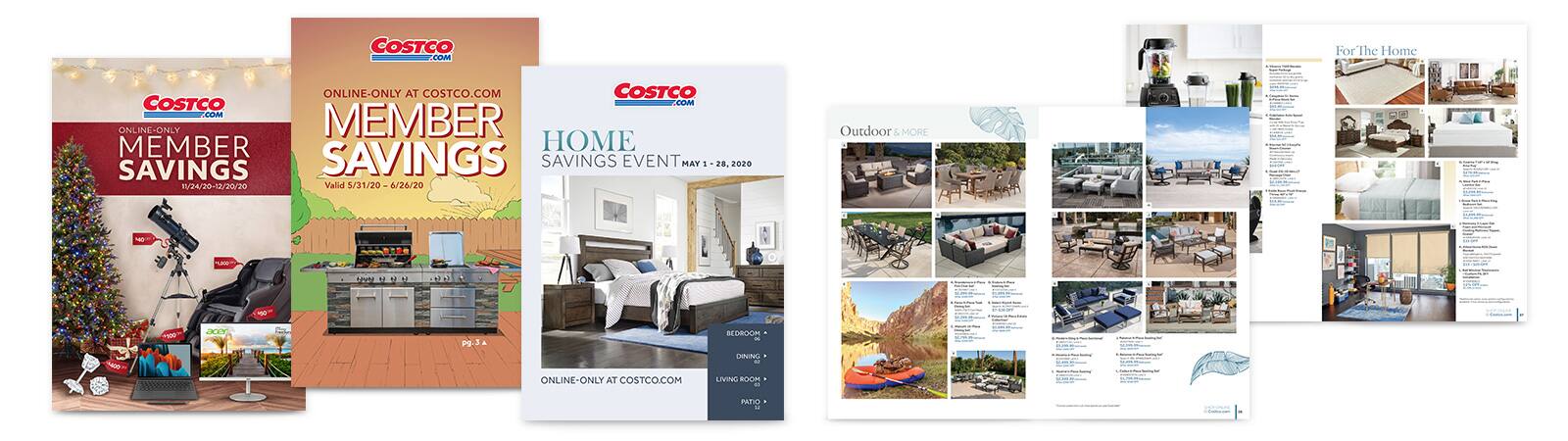
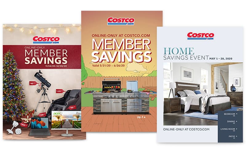
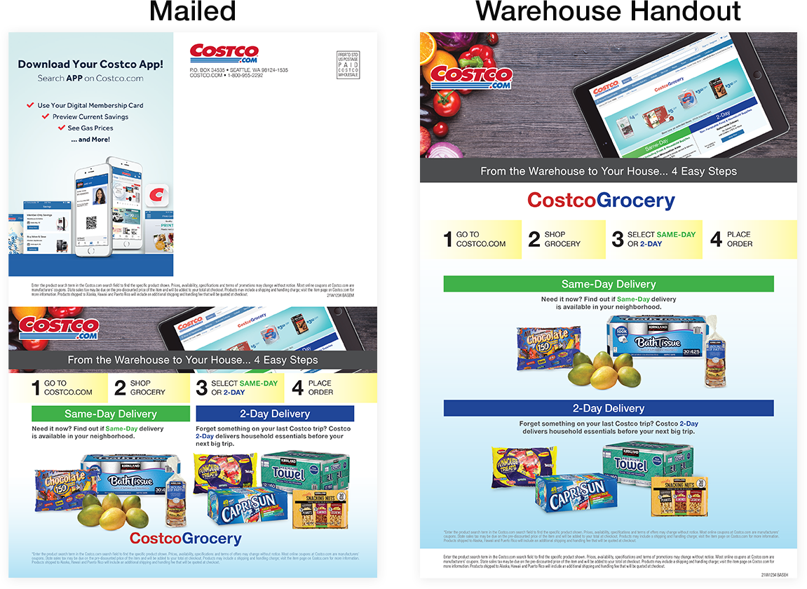
Costco.com marketing campaigns reach millions of Members with the click of a mouse. Whether looking to purchase a single email placement or support a multi-channel marketing effort, there are options for every budget to build an effective campaign. With an average of 20+ million unique weekly homepage visitors, 36+ million total emailable addresses and one of the highest circulation rates in the magazine industry, there's something for every vendor to reach Costco Members. This site will take you through bookable placements and their specifications, while also highlighting best practices and providing resources to maintain a consistent Costco look and feel.


Designing for a Responsive Website

1. Visual hierarchy

Prioritize the elements in the content inventory and determine how to display the most important elements prominently.

2. Design with the smallest breakpoints first

Design for the smallest breakpoint size, then work your way up. 60% of traffic comes through mobile.

3. Avoid complex graphics

Complex graphics don’t display well when your screen is only a few inches across. Cater to mobile users with images that are legible on hand-held screens, reducing text when possible.

4. Test it on a device

Step away from your desktop/laptop computer and tap through pages on a smaller device. Is the site easy to navigate? Are the text and graphics easy to read?

Source: UXPin

Costco.com Homepage Ad Specifications

Acceptable File Formats: Please include all assets that are layered or linked to original working file. For example, PSD should include all layers with smart objects. Please include hi-res logos, elements, images and fonts if possible.

Homepage Hero

Mobile: 1054px by 561px
Desktop: 1400px by 400px

Use a mobile-first approach when designing homepage heroes. Content should be kept to a minimum and simplified whenever possible. This helps ensure good visibility on all device types. Text must be 100 characters or less, including pricing and valid dates to be ADA compliant. Do not add CTAs. Make sure to move important elements away from both sides to avoid the arrows overlapping any text.

Download Template: Homepage Hero

Image

Large Banner

Image

Mobile: 1054px by 450px
Desktop: 1400px by 250px

Use a mobile-first approach when designing large banners. Content should be kept to a minimum and simplified whenever possible. This helps ensure good visibility on all device types. Text must be 100 characters or less, including pricing and valid dates to be ADA compliant. Do not add CTAs.

Download Template: Large Banner

Large Half Banner

Image

800px by 260px
 

Text must be 100 characters or less, including pricing and valid dates to be ADA compliant. Do not add CTAs.

Download Template: Large Half Banner

Medium Banner

Image

Mobile: 1054px by 450px
Desktop: 1400px by 180px

Text must be 100 characters or less, including pricing and valid dates to be ADA compliant. Do not add CTAs.

Download Template: Medium Banner

Medium Half Banner

Image

800px by 200px
 

Text must be 100 characters or less, including pricing and valid dates to be ADA compliant. Do not add CTAs.

Download Template: Medium Half Banner


Large Ads - Coded

Image

658px by 326px
 

Large Ads have coded text below. Do not put text on the image, except logos. Main description should be 90 characters (including spaces and punctuation) or less.

Download Template: Large Ads

Half Hero with Sidekicks

Image

Half Hero: 685px by 685px
Sidekick: 328px by 328px

Half hero may include simple text on the image. Do not include CTAs. Sidekicks text is coded, do not include text on the sidekicks images.

Download Template: Half Hero with Sidekicks

Additional Site Placement

Category Hero

Image

Mobile: 1054px by 561px
Desktop: 1400px by 400px

Text must be 100 characters or less, including pricing and valid dates to be ADA compliant. Do not add CTAs.

Download Template: Category Hero

Search Term Banner

Image

Mobile: 1054px by 450px
Desktop: 1400px by 250px

Text must be 100 characters or less, including pricing and valid dates to be ADA compliant. Do not add CTAs.

Download Template: Search Banner

Category Flyout

Image

320px by 300px
 

Text must be 100 characters or less, including pricing and valid dates to be ADA compliant. Do not add CTAs.

Download Template: Flyout

Warehouse Digital Endcap

Image

3840px by 2160px

Make sure that no text crosses the horizontal or vertical guides, but the image should be as large as possible, and can cross both guides. Text doesn’t need to stay on the left, it can also move to the top right to make more space for the image.

Download Template: Warehouse Digital Endcap

PDP Adhesion Banner

Image

728px by 90px

Text must be 100 characters or less, including pricing and valid dates to be ADA compliant. Do not add CTAs.

Download Template: Adhesion Banner

PDP Right Rail Banner

Image

450px by 160px

Text must be 100 characters or less, including pricing and valid dates to be ADA compliant. Do not add CTAs.

Download Template: Right Rail Banner

Email Ad Specifications

Costco.com emails need to capture attention with a treasure hunt of product offerings that Costco.com has available. With a distribution of over 36 million emailable addresses, Costco.com works hard to keep Members engaged with clean and simple renderings of each product, unique values, features, and the lowest prices. To manage and maintain a consistent look and feel throughout, the Costco.com design team assembles each email within a theme prior to deployment based on the guaranteed size(s) purchased. From our vendors, all we need is the product image or layered assets, a brand style guide (if this applies), and a concise description of the product and price to be featured. Keep in mind for these email placements we guarantee size not location.


Acceptable File Formats: Please include all assets that are layered or linked to original working file. For example, PSD should include all layers with smart objects. Please include hi-res logos, elements, images and fonts if possible.


Email Hero

Image

Mobile: 550px by 450px
Desktop: 696px by 412px

The Secondary Hero placement has the same amount of real estate space as a Primary Hero placement. It's location is lower within the body of the email.

Save all images at 80% quality. Images will be compressed before email is deployed. Text must be 100 characters or less, including pricing and valid dates to be ADA compliant. Try to keep CTA at lower right corner of the hero image, please refer to the template.

Download Template: Email Hero

Email Banner

Image

Mobile: 550px by 285px
Desktop: 696px by 155px

Text must be 100 characters or less, including pricing and valid dates to be ADA compliant. Try to keep CTA at lower right corner of the hero image, please refer to the template.

Download Template: Email Banner

2-Across Blocks

Image

550px by 447px

Do not include text, pricing or CTAs on the image. All item descriptions and pricing go underneath the image. Logos are okay to include on the image.

Download Template: 2-Across Blocks

3-Across Idea

Image

Desktop: 366px by 366px

Do not include text, pricing or CTAs on the image. All item descriptions and pricing go underneath the image. Logos are okay to include on the image.

Download Template: 3-Across Idea

4-Across Feature

Image

275px by 275px

Do not include text, pricing or CTAs on the image. All item descriptions and pricing go underneath the image. Logos are okay to include on the image.

Download Template: 4-Across Feature

2-Across Double Feature

Image

Desktop: 550px by 264px

Do not include text, pricing or CTAs on the image. All item descriptions and pricing go underneath the image. Logos are okay to include on the image.

Download Template: 2-Across Double Feature

Costco.com Print Ad Specifications

Costco.com print advertising exists in two large publications: the Costco.com Mailer, and the Costco.com pages within the Connection. The look and feel of these pages and publications needs to speak to Costco members, so we strive to make the item be the first thing you see, and then price/promotion second. We can do this by keeping the design simple, using clean backgrounds, and having concise descriptions of the items. The pages are designed by our marketing design team, and while there can be ads supplied by our vendors, we require that they abide by our same rule of thumb: Item first, price second.


Acceptable File Formats: Please include all assets that are layered or linked to original working file. For example, InDesign files should include all linked files in the folder. Please include hi-res logos, elements, images (300 dpi) and fonts if possible.

Mailer Back Panel

This ad is printed on the bottom half of the mailer back cover on mailed pieces, and it is printed as a whole page ad on pieces handed out in-warehouse. This ad can be designed by your team and submitted to us as a packaged file (Photoshop or InDesign with all fonts and images included) OR you can send us images and item information, and our team will design it for you.

If you choose to have our design team design your ad, please supply Sign Line 1, Sign Line 2 and item # or search term, as well as the price or dollars off exactly how you want it to appear on the ad.

Dimensions for Back Panel Ad (Mailed):

The ad dimensions are (up to) 7.875"w x 5.4375"h plus 1/8" bleed on all 4 sides for the half-page size.
The ad dimensions are 3.875"w x 4.92"h plus 1/8" bleed on all 4 sides for quarer-page size.

Dimensions for Back Panel Ad (Warehouse Handout):

The ad dimensions are 7.875"w x 10.1975"h plus 1/8" bleed on all 4 sides for the full-page size.

Image

Mailer Sixth Page Layout

These ad spots are created by the Marketing Design team. Please supply an image (either clipped out or a lifestyle shot). Images should be a minimum of 300dpi and 2,000 pixels by 2,000 pixels for print. Please supply Sign Line 1, Sign Line 2, and item # or search term, as well as the price or dollars off exactly how you want it to appear on the ad. Images should be free from any logos, verbiage or added graphics.
The actual size of the ad will depend on the layout of the mailer and if the image is vertical or horizontal. Lifestyle images submitted should have plenty of background around the item to account for bleeds.

Image

Mailer Half Page Layout

Ad dimensions: 7.875” wide x 5.4375” tall, plus 1/8” bleed on all 4 edges.
This ad can be designed by your team and submitted to us as a packaged file (Photoshop or InDesign with all fonts and images included) OR you can send us images and item information and our team will design it for you.

Image

Connection Eighth Page Ads

These ad spots are created by the Marketing Design team. Please supply a lifestyle or cleanly clipped out image. Images should be a minimum of 300dpi and at least 2,000 pixels by 2,000 pixels for print with plenty of background around the product to accomodate for both horizontal and vertical layouts. Images should be free from any logos, verbiage or added graphics. If these are necessary elements for the integrity of your ad, please ensure the image you are providing is a layered or packaged file so these elements can be repositioned if needed to fit the available ad space.

Please supply Sign Line 1, Sign Line 2 and item # or search term, as well as the price or dollars off exactly how you want it to appear on the ad*.

  • Sign Line 1 must remain under 40 characters (spaces included).
  • Sign Line 2 must remain under 100 characters (spaces included) and written in sentence format.

The actual size of the ad will depend on the vertical or horizontal layout of the Connection. Please make sure your image will fit both directions.

Image
Image

Connection Quarter and Half Page Ads

These ads can either be designed by your team and submitted to us as a layered or packaged file (Photoshop or InDesign with all fonts and images included) OR you can send us images and item information, and our team will design it for you.

If you choose to have our team design your ad, please supply Sign Line 1, Sign Line 2 (when applicable) and item # or search term, as well as the price or dollars off exactly how you want it to appear on the ad*.

1/4 Page Ads
  • Vertical: 3.8" x 4.5" + 0.25" bleed on all sides
  • Horizontal: 7.25" x 2.25" + 0.25" bleed on all sides
1/2 Page Ad
  • Horizontal: 7.75" x 4.5" + 0.125" bleed on all sides
Full Page Ad
  • 7.75" x 10.5" + 0.125" bleed all around
Image

Connection Pharmacy Page Ads

These ad spots are created by the Marketing Design team. Please supply a clipped image with a transparent background. Images should be a minimum of 300dpi and at 2,000 pixels by 2,000 pixels for print. Images should be clean and free from any logos, verbiage or graphics. If a logo is necessary for the ad, please provide it as a separate vector-format file.

Please supply Sign Line 1, Sign Line 2 (when applicable) and item # or search term, as well as the price or dollars off exactly how you want it to appear on the ad*.

*Designers import provided information via automation and are not responsible for any typos or grammatical errors. Please check your text carefully.

We are ADA Compliant

Costco Wholesale Corporation is committed to ensuring its websites and mobile apps are accessible to members with disabilities. As part of this commitment, it is our goal to ensure all Costco-created new and updated web content will follow the WCAG 2.1, Level AA Standards. Existing Costco-created web content will substantially conform to WCAG 2.0, Level AA Standards. Reach out to accessibility@costco.com with any questions.

COSTCO DIGITAL ACCESSIBILITY POLICY

Purpose

This policy sets forth the standards and procedures Costco follows to ensure that its websites and mobile applications are accessible. All website or mobile application owners and managers, business content editors or strategists, business analysts, system architects, developers, designers, and testers who support the Costco websites and/or mobile capability are required to understand and comply with this policy and related procedures.

Access Standard

Costco has adopted the Web Content Accessibility Guidelines (WCAG) version 2.1 Level AA as its website accessibility standard (the “Access Standard”). Costco is also committed to ensuring that any applications for mobile devices comply with WCAG 2.1 Level AA to the extent possible.


Third Party Content

Effective August 2017, all new or renewed contracts with third party developers or content vendors include provisions for substantial conformance with the Access Standard. Costco uses good faith efforts to select third party vendors who can meet the Access Standard, provided the vendor also meets all other criteria in the request for proposals and vendor contracts. Content managers shall use best efforts to periodically test third party content on the Costco websites and mobile app(s) to determine if it substantially conforms to the Access Standard. If access barriers are found, the content manager will request in writing that the applicable content vendor update its content to substantially conform to the Access Standard, and that it respond to Costco’s request in writing within 30 days.

Customer Feedback

Our Accessibility Information Page, which appears on our websites and mobile app(s) welcomes individuals who have problems accessing information on our websites or our mobile app(s), feedback, or suggestions, to let us know by calling our support line at 1-800-955-2292 or using Live Chat with a member service center team member during support hours.

Costco Web Accessibility Guidelines

Note: Standards and governance of web accessibility guidelines is an ongoing process. Please contact accessibility@costco.com for questions or concerns.

It is Costco’s policy that content provided for Costco sites by third-party developers and/or vendors conform to WCAG 2.0, Level AA standards. User-generated content is not included.

Key Accessibility features of Costco sites include (but is not limited to):

  1. Appropriate site structure for use with assistive technologies.
  2. Appropriate text equivalents for images.
  3. Appropriate labels for forms and input fields.
  4. Full Keyboard access.
  5. Captioning for videos.
  6. Proper color contrast ratios for text and images with text.

Website owners and managers, web/business content editors/strategists, designers, developers, and quality assurance testers, should read these Guidelines and adopt the practices outlined.


All meaningful images must have a text equivalent.

A text equivalent can be:

  • “Real” text nearby
  • Alt text (100 character limit)
  • Offscreen text
  • ARIA
Image

Images DON’T need alt text, offscreen text or ARIA if they:

Image

Have ‘Real’ text near the image that is conveying the information in the image does not need alt, offscreen or ARIA text.

Image

Images that are purely decorative do not need a text alternative.

Images that don’t need a text alternative should have an empty alt attribute.

Tip: You can check to see if text is “real” or “coded” by highlighting it or using CTRL+F to search for one of the words. Only ‘real’ text that is HTML based, not an image of text, is machine readable.


For images of text - any text that is possible to render with code must be rendered with code
...unless the presentation is essential to the meaning of the image.

Images of text that are acceptable include:

  • Logos
  • Diagrams
  • Situations where there are font licensing restrictions
  • Situations where it isn’t possible to render the text in HTML/CSS
Image

Where images of text must be used, the text alternative must contain the same text presented in the image.

In cases where an image of text is acceptable the image MUST have a text equivalent. A text equivalent can be:

  • “Real” text nearby
  • Alt text (100 character limit)
  • If the text equivalent needs to be longer than 100 characters it should be coded or there should be a text only version available to the user.
Image

Avoid using images of text with over 100 characters.

All videos must have captions. Videos that appear in Canada also require a transcript.

All links must have a descriptive name that makes sense out of context.

Headings should be meaningful and nested in order. Don’t use heading tags for styling or skip heading levels.

All text and meaningful user interface elements, like icons, must have high enough contrast to meet WCAG AA standards. Check with this Color Contrast Checker using the WCAG AA pass/fail criteria.